
Image Credit : Photos by Andrew Schweitzer
Project Overview
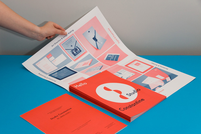
To introduce Studio Constantine to the Australian market, we designed an identity suite articulating the studio’s crafted and conceptual approach.
Organisation
Team
Design and Creative Direction by David and Hannah Constantine
Project Brief
Studio Constantine's design approach is defined by a meeting of concept and craft. We believe that work must always be founded in a strong concept. We don't believe in using 4 inks if 2 will do, and we actively encourage responsible use of resources in printed communications.
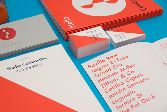
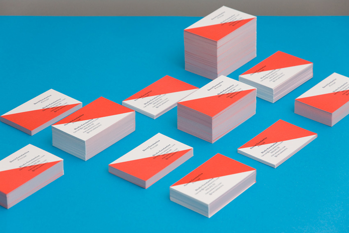
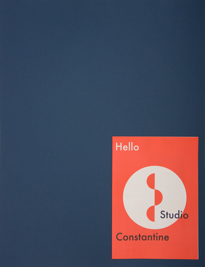
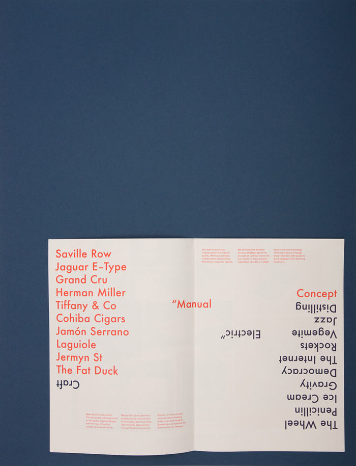
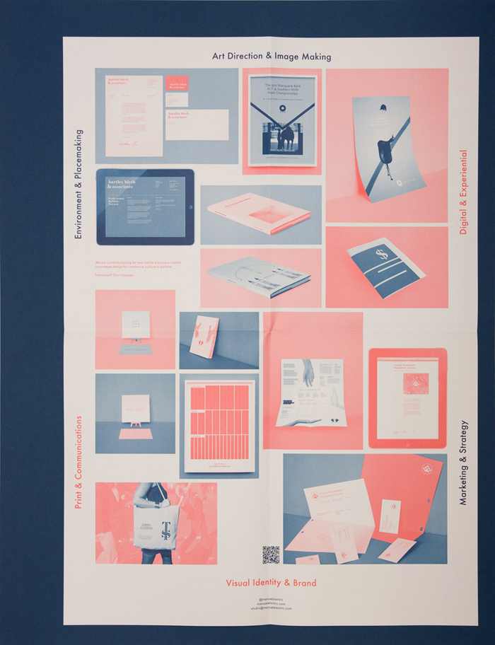
How do you explain to your clients the potential of this philosophy? Show them the best case scenario, and put your own money on the line to prove it!. We have defined a series of identity 'mnemonics' through our stationery and promotional materials; colour, geometry, typography, and format. Each of these serve individually and in concert, to identify the Studio and our approach.
Each piece is a visual essay on the potential for difference in standard formats. We demonstrate this through application of scale, colour, layout, pacing, imagery, knowledge of overprinting and multi-channel spot images.
Project Need
From the visual approach to our brand through to its application, Studio Constantine took a decision to push the boundaries of our work process and practice, in order to demonstrate our 'Conceptual meets Practical' creative offer. Geometry, colour, typography and format are used in preference to the normal constraints of a marque or type and icon lock-up. The result is a breadth of organic brand expressions; related, but not repeated.
We wanted our printed materials to demonstrate the best case achieved by strategic and intelligent use of a 2-colour process, on both premium and commodity stocks. We have used multi-channel duotone image processing on our portfolio imagery.
A QR code directs viewers to a unique landing page on the Studio Constantine website. In using a QR code, we create a physical link between printed and digital brand expressions, which provides greater engagement with our brand.
Design Challenge
We believe that the method and techniques employed by Studio Constantine in producing this suite of materials has a direct relevance to the current needs of the market. In leaner financial environments, the requirement for value in all parts of the design service is acutely felt from commissioning clients. A strong concept or campaign, eloquently executed better utilises a budget and yields greater results, than stylistic copying and bloated production. Our business model is based on it, and this work has resonated with current and potential clients and creative partners alike.
Every piece is exclusively informed. From one end, by the visual identity and Studio manifesto, and at the other, by a requirement of appropriateness to the materials and production process. They are crafted, considered and conceptual, and we believe that this commitment to excellence ought be shared.
Sustainability
As a small start-up business, it is key that we make use of local resources and support our community. Our materials were printed by our local printer, New Litho in Surrey Hills, who are certified by the Forestry Stewardship Council (FSC).
Saxton and Precision paper stocks were chosen for our printed materials. Saxton is one of the leading Australian made specialty papers. It is certified Carbon Neutral by the Department of Climate Change & Energy Efficiency's National Carbon Offset Standard (NCOS), an Australian Government Initiative. Precision is also an Australian made all purpose offset paper, which holds ISO 14001 accreditation and is PEFC certified (Programme for the Endorsement of Forest Certification).
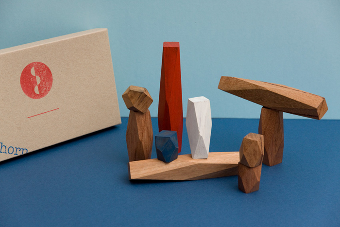
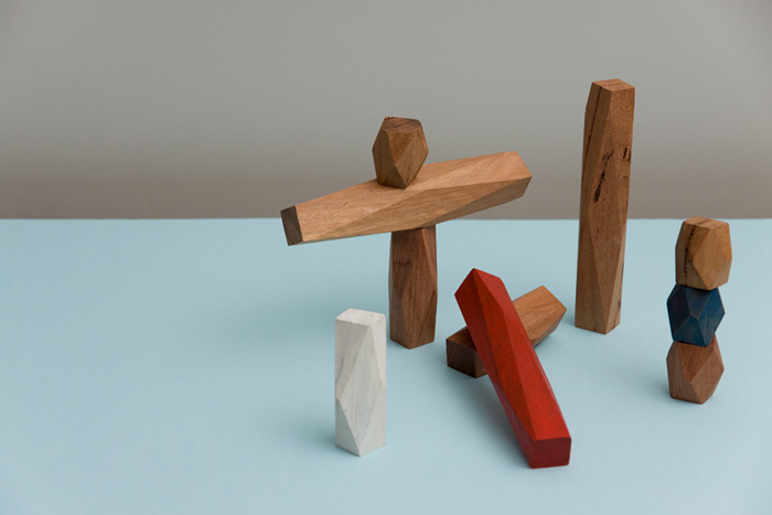
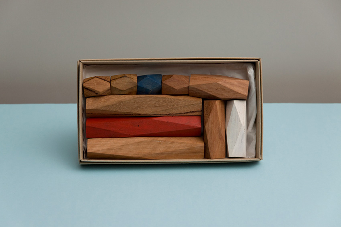
In addition to our printed materials, we also collaborated with Treehorn Design to create a limited set of conceptual building blocks, decked in our livery. The blocks are made from reclaimed and salvaged timber taken from old buildings and construction sites across Victoria. Each of the blocks has been hand-crafted from Australian hardwood, meaning no two blocks are the same. The colours, material tones and wax finish were directed by Studio Constantine and brought to fruition by the skilled hands of Joe Chester. The geometric form and colour of our building blocks reference the language of our identity, and also add an additional vehicle for the expression of the brand.
Graphic Design - Identity and Branding
This award recognises traditional or digital visual representation of ideas and messages. Consideration given to clarity of communication and the matching information style to audience.
More Details